Problem
Problem / solution
Check color contrast before accessibility becomes a rework
Test foreground and background colors while your palette is still flexible, then adjust before the design reaches production.
 Scan to download
Open the App Store directly on your iPhone or iPad.
Scan to download
Open the App Store directly on your iPhone or iPad.
Solution
Color Wheel & Palettes calculates WCAG contrast ratios, labels AA and AAA results, and suggests smarter improvements for failing pairs.
What you can do
Check color contrast before accessibility becomes a rework
- Calculate contrast ratios instantly for chosen colors.
- Check WCAG AA and AAA standards before handoff.
- Use suggestions to improve failing combinations without throwing away the palette.
Questions
Questions
Does the app check WCAG AA and AAA?
Yes. The contrast checker tests color pairs against WCAG AA and AAA standards.
Can it suggest better colors?
Yes. The app provides smart improvement suggestions for combinations that fail.
Is it useful for app design?
Yes. It is designed for web and app designers who need accessible text, button, and interface colors.
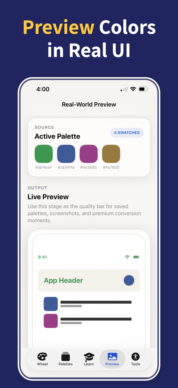
Turn color theory into finished palettes
Download Color Wheel & Palettes and build harmonies, gradients, accessible contrast pairs, and export-ready colors from your iPhone or iPad.