How to use the color wheel
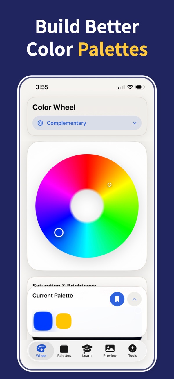
- Pick a base color: drag the marker around the wheel, type a HEX code, or press Random palette.
- Move the marker toward the center for softer, less saturated colors and toward the edge for vivid ones. Use the Brightness slider for darker shades.
- Choose a harmony. The extra markers move with your base color and always keep the same angles, so you can rotate a scheme without breaking it.
- Read the contrast figure under each swatch before you use a color for text: 4.5:1 or more passes WCAG AA for normal-size text.
- Copy a single HEX code, copy the whole palette, or copy a link that reopens the palette exactly as you left it.
Color harmonies on the wheel
A harmony is a fixed geometric relationship on the wheel. Because the angles stay the same wherever the base color sits, you can turn a scheme until it fits your brand, photo or room and it still holds together.
RGB or RYB: which color wheel should you use?
Screens mix light, so digital design uses the RGB wheel. Red, green and blue are its primaries and opposite colors add up to white light: red sits across from cyan, green across from magenta and blue across from yellow. HEX codes, CSS and design tools all work in this model, and it is the wheel the Color Wheel & Palettes app uses.
Paint mixes pigment, and art classes teach the older red, yellow and blue (RYB) wheel. On it red is opposite green, yellow is opposite violet and blue is opposite orange. If you are planning a painting, a room or an outfit, switch the tool to Painter’s (RYB): it rearranges the hues so the harmonies match what you learned, and still gives you screen-ready HEX values.
Neither wheel is wrong. They describe different materials, so choose the one that matches where your colors will end up.
Warm and cool colors, tints, shades and tones
The wheel divides roughly in half by temperature. Reds, oranges and yellows feel warm and seem to come toward the viewer; greens, blues and violets feel cool and recede. A palette with one warm accent among cool colors, or the reverse, usually looks deliberate.
Tints, shades and tones change a color without changing its hue. A tint adds white: drag the marker toward the center or lower Saturation. A shade adds black: lower Brightness. A tone adds grey, which is both at once. The Monochromatic harmony builds these steps for you.
Before colors go into a website or app, check text contrast with the WCAG contrast checker, and for smooth blends between palette colors try the gradient generator.
Where the color wheel comes from
Isaac Newton bent the spectrum into a circle in Opticks (1704), which made it possible to talk about colors as neighbors and opposites. Painters later settled on the 12-part red, yellow and blue wheel that Johannes Itten taught at the Bauhaus: three primaries, three secondaries mixed from them, and six tertiaries in between. Digital tools replaced pigment primaries with light, but the idea of reading harmony from angles on a circle has not changed.